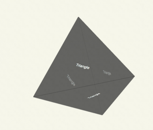
A triangle can be created in CSS by manipulating the borders of an element. Combining four triangles in a 3D space using -webkit-transform, these can be positioned to form a tetrahedron (or pyramid if you prefer).
CSS pyramid - proof of concept
For now this only works in Safari 5.0.2+ and iOS, although 3D transforms will surface in Firefox 4 and the next build of Chrome. The demo doesn’t use JavaScript.
Combining squares and triangles, cubes and pyramids, all sorts of 3D structures are now possible, if you are so inclined. Not necessarily useful, but possible.
The rotation is performed using a -webkit-animation, I’ve given the animation the name spin, which rotates the pyramid around Y from 0 to 360 degrees:
#pyramid {
  -webkit-animation: spin 5s linear infinite;
  -moz-animation: spin 5s linear infinite;
}

@-webkit-keyframes spin {
  from {
    -webkit-transform: rotateY(0deg) rotateX(-20deg);
  }
  to {
    -webkit-transform: rotateY(360deg) rotateX(-20deg);
  }
}

@-moz-keyframes spin {
  from {
    -moz-transform: rotateY(0deg) rotateX(-20deg);
  }
  to {
    -moz-transform: rotateY(360deg) rotateX(-20deg);
  }
}
If you haven’t seen it before, the code to create an approximate equilateral triangle is as follows:
#pyramid > div {
  position: absolute;
  border-color: transparent transparent transparent rgba(50, 50, 50, 0.5);
  border-style: solid;
  border-radius: 3px;
  border-width: 200px 0 200px 346px;
}
Tantek Çelik coined this technique in his study of regular polygons which includes pentagons, hexagons and octagons. The methods are explained over at the Filament Group.
The 3D techniques I’ve used in this experiment are explained in my 3D cube post (July 2009). This is a proof of concept and I haven’t delved into the mathematics or geometry too much, instead opting for the slightly faster but significantly less clever and less reproducible trial-and-error approach.
#pyramid > div:first-child  {
  -webkit-transform: rotateY(-19.5deg);
  -moz-transform: rotateY(-19.5deg);
}

#pyramid > div:nth-child(2) {
  -webkit-transform: rotateY(90deg) rotateZ(60deg);
  -moz-transform: rotateY(90deg) rotateZ(60deg);
}

#pyramid > div:nth-child(3) {
  -webkit-transform: rotateX(60deg) rotateY(19.5deg);
  -moz-transform: rotateX(60deg) rotateY(19.5deg);
}

#pyramid > div:nth-child(4) {
  -webkit-transform: rotateX(-60deg) rotateY(19.5deg) translateX(-116px) translateY(-200px);
  -webkit-transform-origin: 0 0 -326px;
  -moz-transform: rotateX(-60deg) rotateY(19.5deg) translateX(-116px) translateY(-200px);
  -moz-transform-origin: 0 0 -326px;
}