Last week WebKit included the much anticipated (at least on my part) 3D transforms in its latest nightly build, announced practically alongside the awesome Snow Stack demo that provides a 3D interface for browsing Flickr images (use left, right and space-bar). Today the Surfin Safari blog has updated with some more exciting demos, including Morphin Power Cubes and Poster Circle. It is now possible to create all sorts of crazy three-dimensional and animated user interfaces; the power comes largely in -webkit-perspective and a number of updated transforms — adapted to incorporate the Z axis.
Since working on the 3D cube using 2D transforms back in April I’ve experimented with perspective to create something more powerful, playing around with 3D transforms on the iPhone a few times (eg this early rotating demo). Now I’ve got something worth sharing.
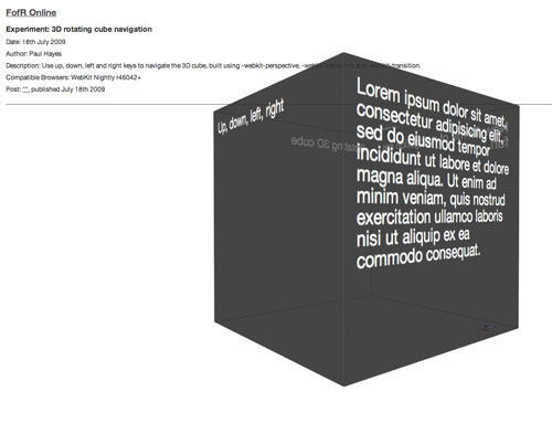
A 3D cube can be created solely in CSS, with all six faces. Using JavaScript to detect key presses and update inline styles this cube can be intuitively navigated.
Result
A 3D cube that rotates using the Up, Down, Left and Right arrow keys.
Supported browsers: WebKit Nightly r46042+
: Cube updated to work with touch gestures and click and drag
: Experiment updated. 3D transforms are now supported in Safari, Chrome and Firefox 10. Although the perspective appears off, probably due to a perspective-origin bug.
How To
I’ll start with the markup, because it’s simple. Each of the six cube faces is given a face class and another relating to it’s number. These six faces sit within a cube container, which sits in another wrapper, each is necessary.
<div id="experiment">
  <div id="cube">
    <div class="face one">
      One face
    </div>
    <div class="face two">
      Up, down, left, right
    </div>
    <div class="face three">
      Lorem ipsum.
    </div>
    <div class="face four">
      New forms of navigation are fun.
    </div>
    <div class="face five">
      Rotating 3D cube
    </div>
    <div class="face six">
      More content
    </div>
  </div>
</div>
The outer wrapper serves as a camera, on which you apply some perspective — appropriate 3D transformations are then applied to descendants. -webkit-perspective defines the depth of the Z-plane and relative sizes of elements above and below it, -webkit-perspective-origin specifies the perspective’s origin. View a perspective example (webkit.org)
#experiment {
  -webkit-perspective: 800px;
  -webkit-perspective-origin: 50% 200px;
}
The second container, the actual cube, has a specified height, margin, position, etc. as usual. The height and width are necessary to create some confines for the cube face transformations — alternatively the width defaults to 100% and the cube’s appearance would vary with window width. -webkit-transition (documentation) defines the animated property, duration and timing-function — we’re animating the 3d transformation (via -webkit-transform) linearly for two seconds. -webkit-transform-style determines whether child elements lie flat against their parent (flat) or remain in 3D space (preserve-3d).
#cube {
  position: relative;
  margin: 0 auto;
  height: 400px;
  width: 400px;
  -webkit-transition: -webkit-transform 2s linear;
  -webkit-transform-style: preserve-3d;
}
Using the .face class common styles are applied to the six sides; colouring, size, padding, etc. Importantly they are each positioned absolutely, relative to the cube container. The background rgba property is included to make the cube look pretty and transparent.
.face {
  position: absolute;
  height: 360px;
  width: 360px;
  padding: 20px;
  background-color: rgba(50, 50, 50, 0.7);
}
Each of the faces, one through six, needs to be rotated in 3D space to its correct starting position. Using translateZ the elements are brought 200px (half their width) off the Z-plane. Each of the faces must be at 90 degrees. Rotating solely in the X plane positions the top and bottom faces (one, six), before rotating the last four faces in the Y plane, much like origami. The extra rotate on the sixth face rotates the content in 2D space to correct its orientation.
#cube .one  {
  -webkit-transform: rotateX(90deg) translateZ(200px);
}

#cube .two {
  -webkit-transform: translateZ(200px);
}

#cube .three {
  -webkit-transform: rotateY(90deg) translateZ(200px);
}

#cube .four {
  -webkit-transform: rotateY(180deg) translateZ(200px);
}

#cube .five {
  -webkit-transform: rotateY(-90deg) translateZ(200px);
}

#cube .six {
  -webkit-transform: rotateX(-90deg) translateZ(200px) rotate(180deg);
}
Our cube is now complete — but it doesn’t move! With a keydown event listener we can increment X and Y angles based on different key presses, before applying them as inline styles on the cube container. In combination with the transition effect on #cube, all six faces rotate in sync from their original position to the newly defined angle, creating a seamless 3D cube interface.
var xAngle = 0, yAngle = 0;
document.addEventListener('keydown', function(e) {
  switch(e.keyCode) {

    case 37: // left
      yAngle -= 90;
      break;

    case 38: // up
      xAngle += 90;
      break;

    case 39: // right
      yAngle += 90;
      break;

    case 40: // down
      xAngle -= 90;
      break;
  };

  $('cube').style.webkitTransform = "rotateX("+xAngle+"deg) rotateY("+yAngle+"deg)";
}, false);