For the default FofR Online theme, the first of many, I have chosen a simple appearance that focuses on the beauty of fonts and typography. The header uses a sans-serif font, on OS X this will be Helvetica Neue, on Windows the CSS font stack allows the design to fall back to the more common Arial, plain old Helvetica isn’t used because some Windows machines have a terrible low quality version installed. The content area is distinguished with a serif font, for the time being (no pun intended — where would I be if I started making typeface puns?), this is Times New Roman. I may experiment further with less common serif fonts that are installed on a good majority of machines (eg with MS Office or Adobe CS4), falling back to Times New Roman if necessary.
Update: I have slightly altered the content’s stack to begin with Apple’s Times font rather than Times New Roman, mainly for the superior glyphs that it offers, take for instance ‘fi’ in this post’s title. I’m attempting to research the differences between Times and Times New Roman beyond a simple comparison though internet sleuthing has not proved fruitful.
I’ve spent a short amount of time researching leading, kerning, the measure, et al to improve the legibility of the content region (eg The Design Cubicle). I’ve increased the CSS line-spacing and slightly upped the word-spacing to make the content area more readable. The design’s horizontal dimensions are all defined in _em_s, so the page scales correctly with changes in font size — always maintaining an appropriate measure in the region of 78 characters, a couple of alphabets — a good rule of thumb for legibility. The vertical alignment in the header uses pixels to keep the desired appearance. The header image uses the text-indent text replacement technique and a transparent PNG that uses Helvetica Neue to achieve a consistent branding style across platforms.
Mark Boulton states that the leading should increase proportionately with the measure. I am tempted to create a small JavaScript project for a fluid web layout that dynamically alters the CSS line-spacing of the content based on the width of the window and hence the measure; just to see how things change. I think the first problem may be deciding the scaling factor to apply to the line-spacing.
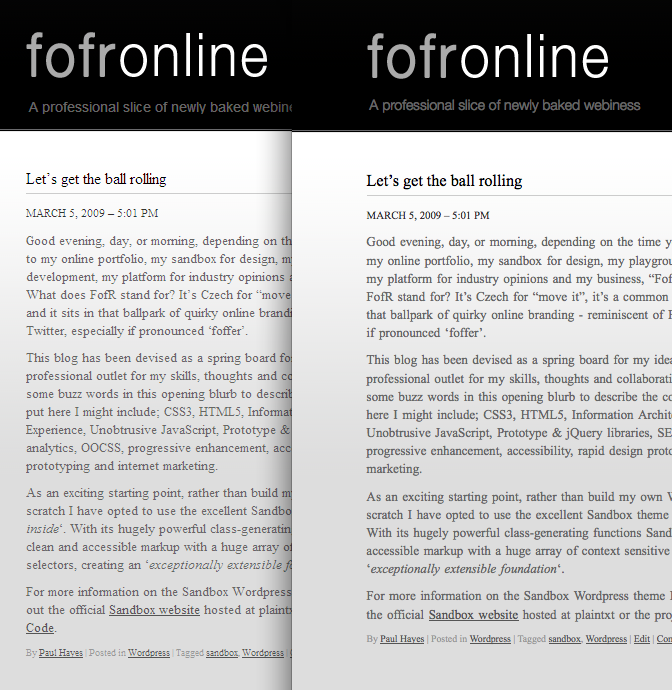
One of the biggest caveats of creating a design that strongly relies on the beauty of fonts is the difference in Windows and Apple font rendering. Take for instance the screen capture below which compares Windows XP (Left, IE7) with OSX (Right, Firefox 3). My preference is towards Apple’s stylish approach that attempts to match print, versus Microsoft’s pixel jamming but easier to read pragmatic rendering. By using fonts as the predominant styling force on the page it is clear that in this case the Apple approach is superior. Joel on Software has a very nice article that makes a good comparison between the two.
Areas still left to develop include the right hand columns, a proper grid layout and the footer, I have put these aside until next week.